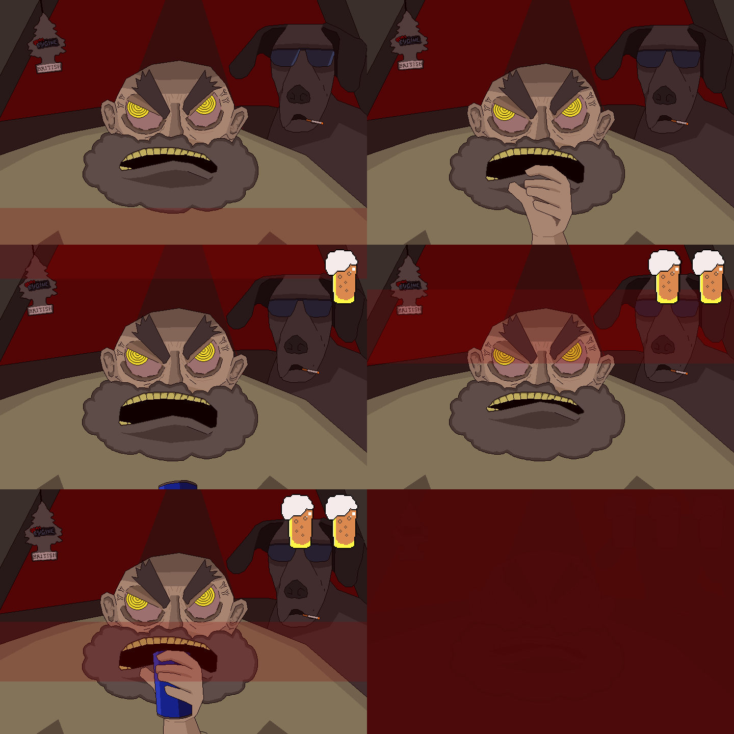
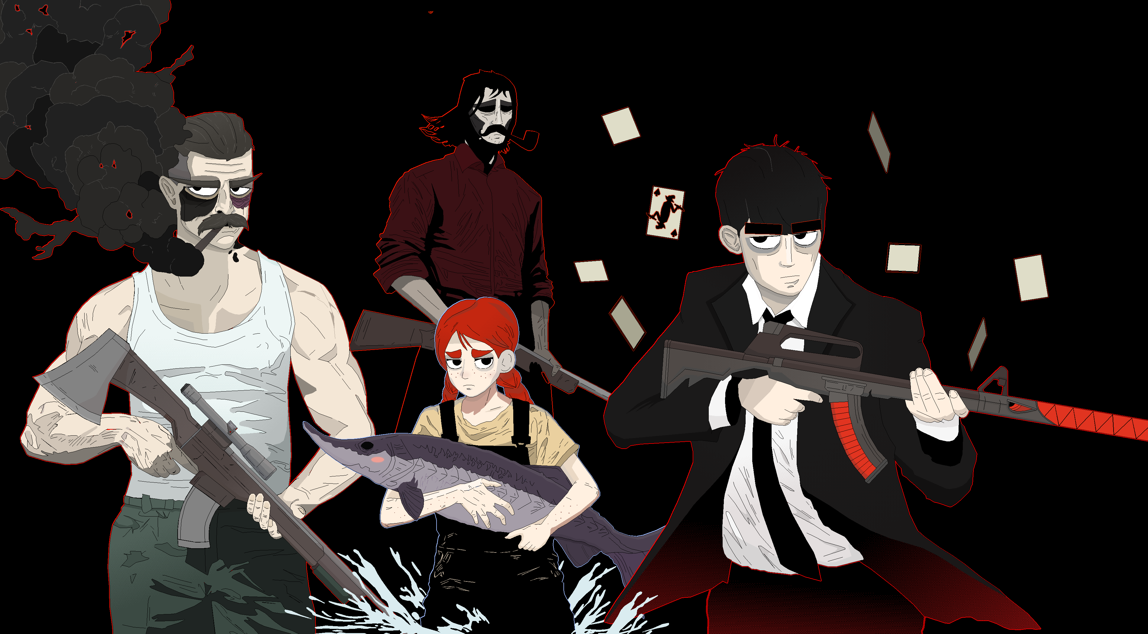
ACT3 VIDEO - FIRST 40 minutes, feedback wanted.
Dreams of Joy Departed » Devlog


This video contains the first 40 min of ACT3, although it is not finished work.
It does contain spoilers albeit minor ones since it is the beginning. It covers about 25% of the entire act I would say.
It shows how the act will work and what the tone is, which is somewhat of a big departure from ACT1 and 2.
If you watch it I would love to hear some tips, opinions and requests, no matter how minor they are. It will only help me to improve the experience!
I am happy to return the favor and go through other people's games, just tell me if you want me to.
Get Dreams of Joy Departed
Download NowName your own price
Dreams of Joy Departed
A surreal RPG. A tragedy with turnbased combat and a hidden morality system.
| Status | In development |
| Author | horbror |
| Genre | Role Playing, Adventure |
| Tags | agdg, Atmospheric, Horror, Indie, Singleplayer, storygame, Surreal, Turn-Based Combat |
| Languages | English |
More posts
- Going forward, going backwards.Nov 17, 2024
- /v3 UpdateJun 22, 2024
- Polishing continues...May 24, 2024
- DD Update - Haterun in, Punisher ending in, visual updates for act 2.May 04, 2024
- Haterun ACT 3 is inMar 26, 2024
- DD Demo is up, more haterun content added.Feb 29, 2024
- Updated act 1 with some additional polish.Feb 24, 2024
- Normal Ending is inFeb 14, 2024
- Demo4 featuring the Saviour Ending is upJan 04, 2024
- ACT4 INTRO CUTSCENESDec 15, 2023

Comments
Log in with itch.io to leave a comment.
ahoy, i gave it a watch and i took down some notes.
to get the obvious out of the way, i don't play RPGM games, the only ones i've ever played were DD submissions. i also don't have a lot of experience with deep story-rich games dealing with complex emotional issues, i'm more of an action kind of guy. with that said, take my feedback with more than a punch of salt since i'm not your target audience and chances are i don't know what i'm talking about.
>basics
crop your video in obs or whatever else. showing your desktop will make people tab out early since they'll assume this is rushed - so why would they spend 45mins of their time for something "rushed"?
>intro cutscene
the animations are great, but this is the only (group of) cutscene(s) where the pacing feels off. it gives me a feeling that unimportant scenes (like transitional scenes) are too long, while important (to me at least?) scenes are very short. i don't really know how else to put it, but i'd advise to look through it a few times and to slightly shorten some scenes.
>language
the standard way to notice ESL writing in my opinion is the lack of shorthand. people aren't really that verbose in their thoughts or when speaking to others. Nobody would ever say "What the fuck is wrong with this person" but instead "What's fucking wrong with her?". there was a lot of "wasted" space as well - talking to the instagram girl had a few "huh?" "what?" boxes. while they do convey the message that Sarah has no idea what's being said, it can probably be done in a better way instead of having every reply of hers be "huh?" another thing that was annoying was that two messages from the same character (Sarah saying watch your mouth -> do you have any smokes") was divided into two boxes. at first i thought the instagram girl was speaking since usually a text refresh indicates a new character is speaking.
>visuals
great stuff. sarah is cute. world design is interesting, but i'd specifically like more uses of camera position. don't know how to explain this, but i liked the elevator scene before you go to gordon, with how everything is contained on the left side of the screen and the right side is just the red elevator background. more stuff where the player isn't in the center is a nice change of pace. following up that scene, it would be cool if the black background in those scenes (especially the one in gordon's place) would just use the red elevator background instead of having both. you already have such a nice texture, may as well use it fully.
>martha and crab pictures, mosca playing card
nice.
>Avatars/images of characters
different expressions for speaking characters or to show emotions would go a looooong way here. i think this is the #1 thing you should focus on
>music
excellent. top tier. beautiful. i especially like the saint of the blind fight theme. whoever does your vocals is top tier
otherwise everything else is great. i can't comment on the story other than that i'm enjoying it. the characters all have distinct personalities. the setting is engaging, and the story is evolving at a good pace. i like the catboy slavs, cyka. they represent our heritage well.
keep up the good work! i'm eagerly monitoring your progress.
Basics crop your video in obs or whatever else:
The full screen options in the game work like shit at the moment, this is why I always do this, but I agree with you. Once its time to make some "real" trailers I will make sure to have that fixed. I also need to fix the full screen option overall. At the moment I can only port a build that either only does full screen or not at all, it is really stupid.
Intro cutscene the animations are great, but this is the only (group of) cutscene(s) where the pacing feels off:
Once the entire act is done I will do some serious thinking about this, there are some details I just haven't added yet, like the bus passing by in one of the "city shots" at the end, and the dollars actually having details. I am not certain those details fix the pacing, however, I might just add a couple of other new things too.
Text stuff: Very good input. I dont know how many times I edited the dialogue in ACT 1 and 2 but I will keep all of this in mind when I start endlessly going through the entire act.
Concerning maps and backgrounds:
I am not entirely sure how I feel about this, I will try to gauge what and how I change up things when I have had further input.
. >Avatars/images of characters different expressions:
I do share this opinion, my biggest problem is that there are just so many characters, and even more coming up further down the line. There are some altered "portraits" with very minor details changed at the moment, I do want to create a lot more of them with different poses but I think this will have to be in the future.
>music excellent. top tier. beautiful:
Thank you, all of the vocals are done purely with "programming" and editing. No AI-stuff, it is done by creating the melodies with piano rolls and midifiles, adding words through a synthesizer program and altering them phonetically to get the timing and sound sort of right. The "voiceacting" is just shitty text to speech altered through the wonderful capabilities you get when you combine paulxstretch, audacity and reason 5. I should make a video on this sometime so other people can just do the same if they want to.
Glad you did not find the "Russian tracksuit stereotype" offensive, the Russians on twitter who saw it enjoyed it as well. The cat ears is a small reference to that agdg Russian catboy streamer btw.
Thank you for all your extremely valuable input!